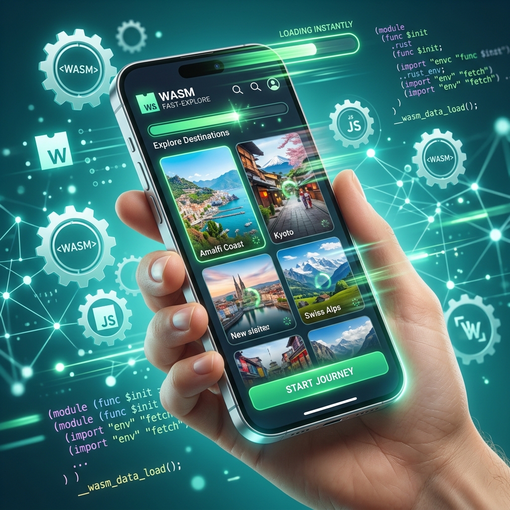
We live in a mobile-first world. In 2026, over 75% of all web traffic originates from smartphones. These devices feature incredible OLED screens and fast silicon chips, but they still face two major friction points: **Variable Network Speeds** and **Strict Battery Limitations**. As a website owner, your image content strategy directly impacts both of these pain points. If your site is "image-heavy" without being "image-smart," you aren't just slowing down the page rendering; you are literally draining your users' batteries and burning through their monthly data caps.
In this comprehensive 1500+ word UX-focused technical guide, we will explore the psychological and hardware impact of image optimization on mobile users. We'll look at how the physical architecture of mobile browsing responds to bloated files, and how 3esk Converter helps you build a world-class, frictionless mobile experience.
1. The Psychology of the "Blank Screen"
Mobile users are notoriously impatient. Research consistently shows that if a mobile page takes more than 3 to 4 seconds to load, over 50% of users will simply abandon the site. When a mobile user clicks a link and sees a blank white screen while a massive 2MB hero image slowly "drips" onto the screen line-by-line, they feel a sense of profound frustration. This is perceived as a broken experience.
This frustration leads directly to a high **Bounce Rate**, a critical metric that tells Google your site is not valuable to searchers. By using modern formats like WebP to compress your heroic assets into 90KB files, you ensure the image loads within the first 800 milliseconds, entirely preventing this psychological friction.
2. Hardware Reality: CPU Decoding and Battery Drain
Most website owners think of image size purely in terms of downloading bytes over the network. However, there is a second, hidden cost: **Decoding**. When an image is downloaded, it is mathematically compressed. The phone's CPU (an ARM-based chip like an Apple A-Series or Qualcomm Snapdragon) has to run complex algorithms to unpack that data and turn it into RGB pixels on the screen.
If you use an ancient format like heavily-layered PNG or an unoptimized Baseline JPG, the phone's CPU has to work extremely hard, spinning up its "performance cores." For a user standing in the sun with 10% battery left, a "heavy" site parsing massive images can be the difference between their phone staying on or dying completely. Conversely, modern formats like **AVIF** and **WebP** are designed to be hardware-accelerated, meaning the phone decodes them using dedicated, low-power media engines perfectly, preserving the user's battery.
3. CSS Pixels vs. Physical Device Pixels (The Retina Trap)
Modern smartphones have "Retina" or "High-DPI" screens. This means a screen that claims to be 400 pixels wide in CSS might actually have 1200 physical microscopic LEDs across its width (a 3x pixel density).
To make images look sharp on these screens, developers often serve images that are 3 times larger than necessary. The mistake? Serving those 3x images to *everyone*, including users on older, low-density screens. This wastes massive amounts of bandwidth.
- The HTML Fix: Use the `srcset` attribute.
<img src="image-1x.webp" srcset="image-2x.webp 2x, image-3x.webp 3x" alt="Optimized example"> - This allows the mobile browser to calculate its own screen density and only download the specific file size it needs. You can generate these multiple sizes effortlessly using our Batch Image Resizer.
4. Data Anxiety in Emerging Markets
If your website targets a global audience, you must understand "Data Anxiety." In many emerging markets, mobile data is sold in strict prepaid blocks, or network speeds are capped at 3G. Loading a single "modern" news article with 15 uncompressed 1MB images can cost a user a significant portion of their daily data allowance.
If your site chews through their data, users will remember your brand and actively avoid visiting your domain when they are away from Wi-Fi. Aggressive optimization is an act of **Respect** for your global audience's financial resources.
5. The Layout Shift Disaster (CLS)
We have all suffered the "Ghost Tap." You go to click a link on a mobile page, but a fraction of a second before your finger hits the glass, an image finally finishes loading. The image forces the text downward, and you accidentally click a totally different button (often an intrusive ad). This phenomenon is called **Cumulative Layout Shift (CLS)**.
CLS is uniquely infuriating on mobile because the screen is so small; a 200px shift pushes the entire visible viewport.
- The Solution: Always define your image dimensions. When you use 3esk, check the final dimensions of your WebP file and write them directly into your HTML: `<img src="optimized.webp" width="800" height="600">`. This "reserves" the physical block on the screen before the image even begins downloading, ensuring a smooth, stable scrolling experience.
6. Progressive Rendering vs. Skeleton Screens
A mobile UX best practice is "Perceived Performance." Even if an image takes 2 seconds to load, you can make the wait feel instantaneous.
- Use Progressive JPG/WebP: These formats load a blurry, low-resolution "preview" instantly, then gradually sharpen. The user's brain processes the blurry shape and assumes the site is fully loaded, keeping them engaged.
- Skeleton UI: Apply a soft grey pulsing background to the `
` container while the real image downloads. This signals to the user that content is actively arriving, rather than leaving them staring at broken white space.
7. FAQ: Mobile UX Image Mastery
Q: Do I really need to resize images if I compress them heavily?
Yes. A 4000x3000 pixel WebP might be small in bytes, but it still requires the phone to map 12 million pixels into memory (RAM) before scaling it down to fit a 400px phone screen. Use our Resizer to match the physical dimensions to the CSS container to save both bandwidth and RAM.
Q: Is lazy loading good for mobile?
Yes, absolutely. Add `loading="lazy"` to any image that is not immediately visible when the page first loads (the "Below the Fold" images). This stops the phone from downloading data the user might never scroll down to see.
Q: Can I just use CSS background-images instead of HTML img tags?
Avoid using CSS backgrounds for important content. Mobile browsers often delay loading CSS backgrounds until after the HTML is fully parsed, meaning they load much slower. Always use the `` tag for critical visual content.
Conclusion: Optimize for People, Not just Bots
While passing Google's Core Web Vitals is important for your SEO rankings, the ultimate judge of your website's quality is the human being holding the smartphone. A fast, respectful, stable, and visually sharp mobile experience builds deep brand loyalty and dramatically increases your conversion rates.
Don't let bloated, unoptimized assets ruin your mobile potential. Take control of your digital weight. Use 3esk Converter today to compress, resize, and format your entire library, thereby providing a premium, fully-optimized experience for every user, on every device, across the globe.
Build a Better Mobile UX Today
Optimize your assets for the modern smartphone. Convert to WebP and resize in bulk. Fast, free, and designed for user retention. Try 3esk today.
Go to Converter